Practical 2
Practical 2: Layout and Map Designing in GIS Software (Thematic Mapping)
1. Aim/Objective
To understand the principles of map layout design and to create three distinct types of thematic maps—Choropleth, Dot Density, and Graduated Circles—using Geographic Information System (GIS) software to visualize and analyze the spatial distribution of attribute data.
2. Apparatus/Components Required
- Hardware: Desktop PC or Laptop (Minimum specifications: 8GB RAM, Multi-core processor, 500GB Storage).
- Software: QGIS (v3.16 or higher) or ESRI ArcGIS Desktop/ArcGIS Pro.
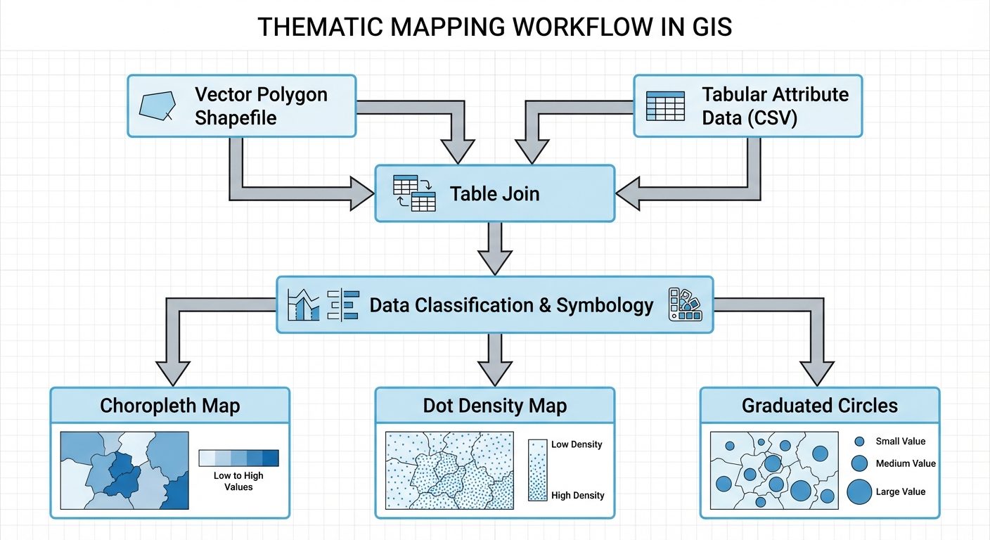
- Data Components (Inputs):
- Vector Data: Polygon Shapefile representing administrative boundaries (e.g., states, counties, or districts).
- Attribute Data: Tabular dataset (CSV or Excel format) containing socio-economic variables such as total population, land area, and crop yield.
3. Theory
A Thematic Map is a type of map specifically designed to show a particular theme connected with a specific geographic area. Unlike general reference maps, thematic maps portray the spatial pattern of a single or a few statistical variables.
- Choropleth Map: Uses differences in shading, coloring, or the placing of symbols within predefined areas to indicate the average values of a property or quantity in those areas. It is best used for normalized or derived data (e.g., population density, literacy rate).
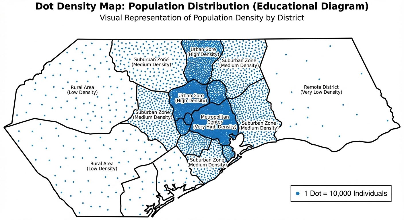
- Dot Density Map: Uses a dot symbol to show the presence of a feature or phenomenon. Each dot represents a specific quantity of the variable (e.g., 1 dot = 5,000 people). It relies on visual scatter to show spatial clustering.
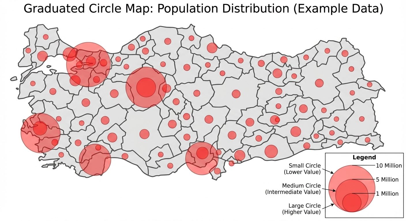
- Graduated Circle Map: Uses circles of varying sizes to represent quantitative data associated with specific point locations or polygon areas. The size of the circle is proportional to the value of the attribute (e.g., total GDP, total sales). It is ideal for displaying absolute numbers.
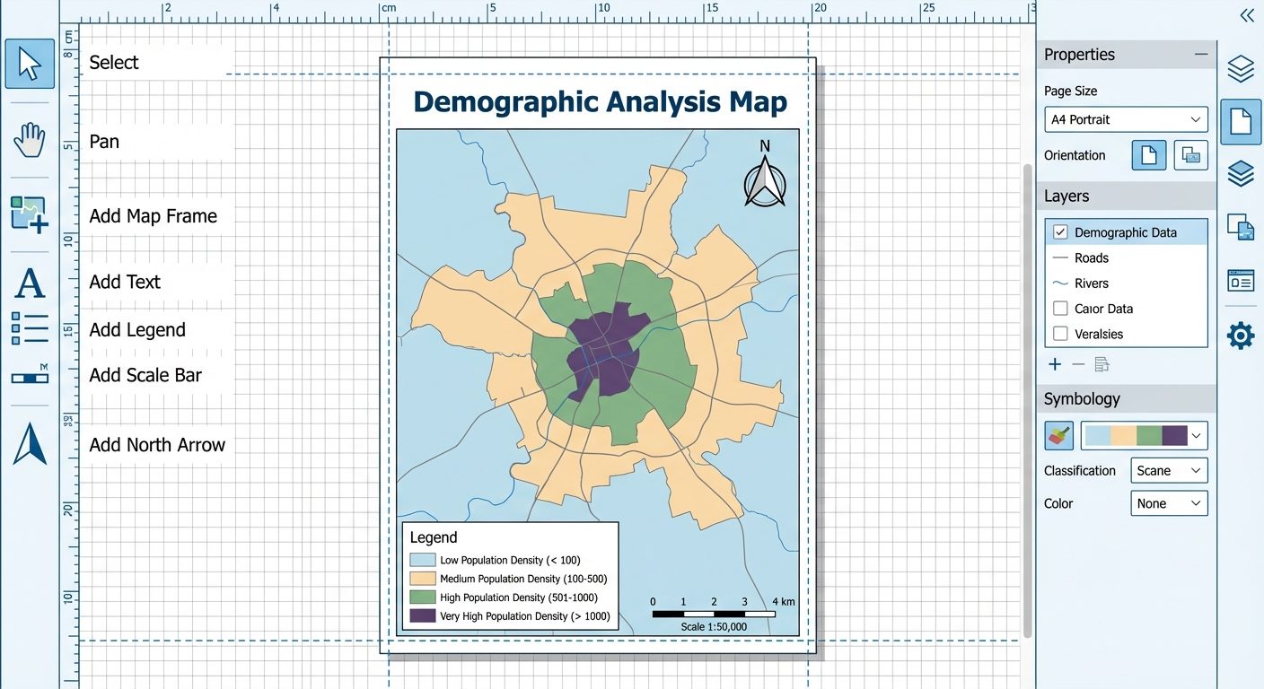
- Map Layout Elements: A scientifically correct map must include essential layout components known as "TALDOGS" (Title, Author, Legend, Date, Orientation/North Arrow, Grid, Scale).
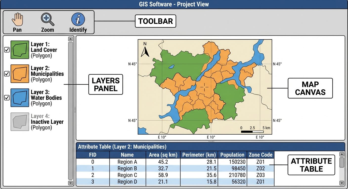
4. Software Interface / Experimental Setup
The GIS software operates using a layered architecture. The interface consists of a Layers Panel (Table of Contents) to manage data hierarchy, a central Map Canvas for visual representation, and a Print Layout Designer for final map composition.
5. Procedure
Part A: Initial Setup & Data Joining
- Launch the GIS software (e.g., QGIS).
- Go to
Layer > Add Layer > Add Vector Layerand browse for your administrative boundary polygon shapefile. Add it to the map canvas. - Go to
Layer > Add Layer > Add Delimited Text Layerto import your tabular CSV data. - Right-click the polygon layer in the Layers panel and select
Properties. - Navigate to the
Joinstab. Click the+icon to add a new join. - Set the Join Layer to your CSV, the Join Field to the common ID column, and the Target Field to the matching ID in your shapefile. Click
OK.
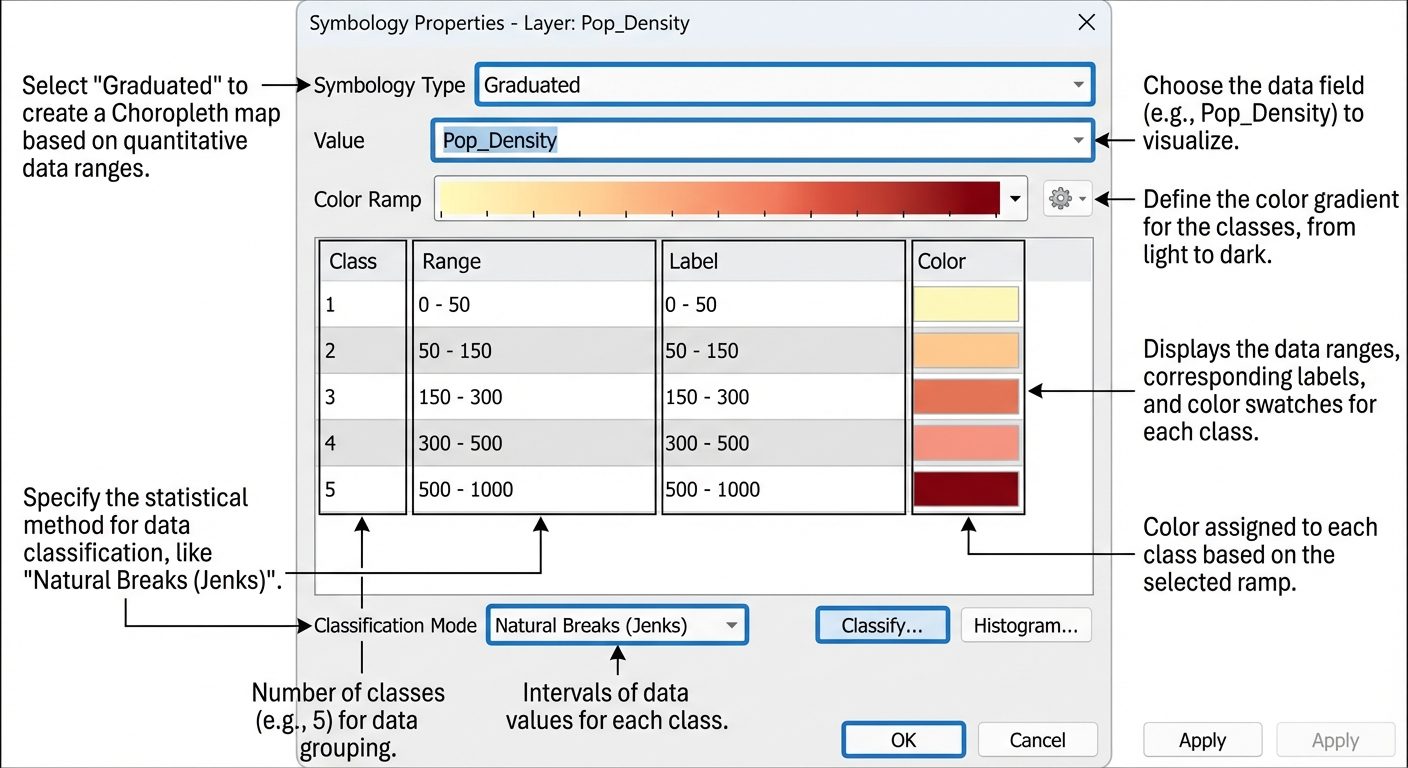
Part B: Creating a Choropleth Map (Population Density)
- Right-click the joined polygon layer and select
Properties. - Go to the
Symbologytab. - Change the render type from Single Symbol to Graduated.
- In the Value field, select the column representing "Population Density".
- Choose a suitable Color Ramp (e.g., sequential light-to-dark yellow-to-red).
- Under Mode, select Natural Breaks (Jenks) and set Classes to 5.
- Click
Classifyand thenApplyto see the Choropleth map on the canvas.
Part C: Creating a Dot Density Map (Total Population)
- Duplicate your polygon layer in the Layers panel. Rename it to "Dot Density".
- Open its
Properties > Symbology. - (If using QGIS): Change the symbol type from Simple Fill to Point Pattern Fill or use the Dot Density renderer if available.
- Define the representation ratio (e.g., 1 Dot = 10,000 persons). Set the dot size to a small, readable dimension (e.g., 0.5 mm).
- Ensure the dots are constrained within the polygon boundaries. Apply the settings.
Part D: Creating a Graduated Circle Map (GDP/Crop Yield)
- Duplicate the original polygon layer again. Rename it to "Graduated Circles".
- Open
Properties > Symbologyand select Graduated. - Select a quantitative field (e.g., "Total_GDP").
- Instead of "Color", set the Method to Size.
- Define the minimum and maximum symbol sizes (e.g., 2 mm to 15 mm).
- Select an appropriate marker symbol (usually a circle with a semi-transparent fill).
- Click
ClassifyandApply.
Part E: Layout and Map Designing
- Go to
Project > New Print Layoutand give it a name. - Add a Map: Click
Add Item > Add Mapand draw a rectangle on the blank canvas. - Add a Title: Use the
Add Labeltool to place a prominent title at the top. - Add a Legend: Click
Add Legend, place it on the layout, and use the Item Properties panel to remove unnecessary items and format text. - Add North Arrow & Scale Bar: Use
Add North ArrowandAdd Scale Bar, placing them strategically (usually top-right for North arrow, bottom for Scale bar). - Export the final layout via
Layout > Export as PDForExport as Image.
6. Observations / Attribute Tables
Before creating thematic maps, raw attribute data must be inspected. Below is a sample truth table/attribute connection showing how raw data maps to visual classes.
| Feature ID | Region Name | Total Pop. (Raw) | Area (Sq.Km) | Calculated Density | Choropleth Class | Graduated Circle Size |
|---|---|---|---|---|---|---|
| 01 | Alpha | 1,500,000 | 5,000 | 300 | High (Dark Red) | Large (12mm) |
| 02 | Beta | 200,000 | 4,000 | 50 | Low (Light Yellow) | Small (3mm) |
| 03 | Gamma | 800,000 | 2,000 | 400 | Very High (Brown) | Medium (8mm) |
| 04 | Delta | 600,000 | 6,000 | 100 | Medium (Orange) | Medium (6mm) |
7. Calculations (Data Normalization)
When creating a Choropleth map, mapping absolute numbers (like total population) provides a distorted view because larger areas naturally hold more people. Data must be normalized (converted to ratios, rates, or percentages).
Formula for Density:
Sample Calculation for Region Alpha:
8. Result
- The Choropleth Map successfully displayed normalized data (population density), accurately highlighting intensely populated areas using a graded color ramp.
- The Dot Density Map effectively visualized the absolute spatial distribution of the population, allowing viewers to identify clustering.
- The Graduated Circle Map provided an immediate visual comparison of total absolute values across regions based on proportional circle sizes.
- A professional, publication-ready map layout was successfully designed containing all fundamental cartographic elements (Title, Legend, Scale, North Arrow).
9. Viva Questions
Q1. What is the difference between a reference map and a thematic map?
Answer: A reference map displays general geographic features (roads, rivers, boundaries) for navigation or location. A thematic map focuses on portraying a specific theme or statistical variable (e.g., rainfall distribution, poverty rates) over a geographic area.
Q2. Why should you NOT use total/absolute values for a Choropleth map?
Answer: Using absolute values ignores the varying sizes of polygon areas, leading to visual bias. Larger areas will look heavily weighted simply because they are large. Data must be normalized (e.g., density, percentages) for an accurate Choropleth map.
Q3. Explain the "Natural Breaks (Jenks)" classification method.
Answer: Natural Breaks is a data classification method designed to optimize the arrangement of a set of values into "natural" classes. It minimizes variance within classes and maximizes variance between classes, placing class breaks where there are sudden jumps in data values.
Q4. When is it most appropriate to use a Graduated Circle map over a Choropleth map?
Answer: A Graduated Circle map is best when visualizing absolute, distinct quantities (e.g., total number of hospitals per district) rather than rates or densities.
Q5. What are the essential elements of a good map layout?
Answer: The essential elements include a clear Title, a Legend explaining symbology, a Scale Bar, a North Arrow indicating orientation, the Map Body, and metadata (author, date, data source).
Q6. In a Dot Density map, does the dot represent an exact geographical location?
Answer: Generally, no. In an area-based dot density map, dots are randomly distributed within a polygon boundary to represent a quantity. They do not indicate the exact GPS coordinate of the phenomenon.
Q7. What is a "Table Join" in GIS?
Answer: A table join is the process of appending non-spatial tabular data (like a CSV file) to a spatial layer's attribute table based on a common field (e.g., a shared District ID), allowing the spatial mapping of the tabular data.