Unit 3 - Notes
Unit 3: Exploratory Data Analysis
Exploratory Data Analysis (EDA) is an approach to analyzing datasets to summarize their main characteristics, often using statistical graphics and other data visualization methods. It is a critical step before formal modeling, ensuring the data is understood, clean, and suitable for machine learning algorithms.
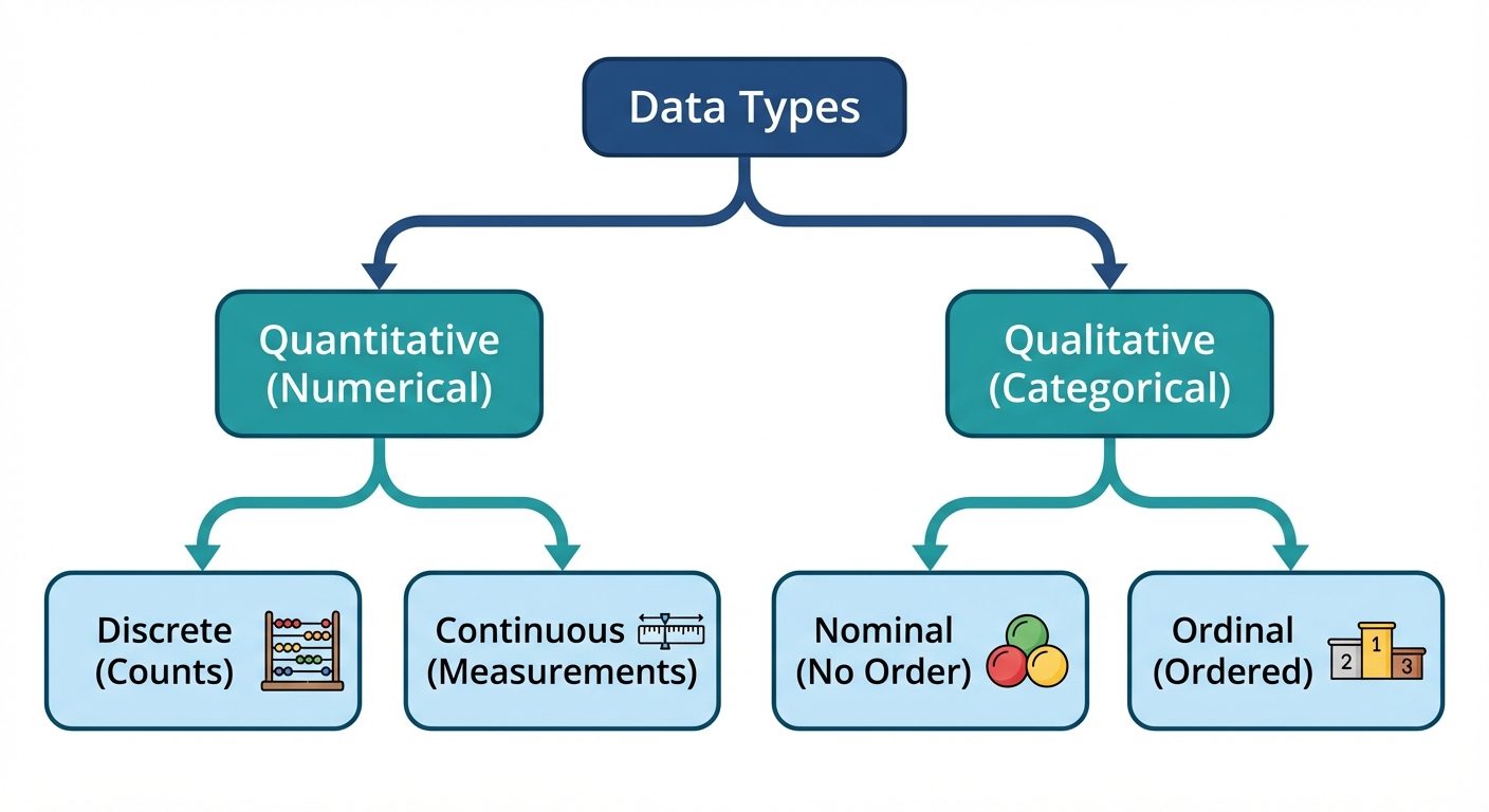
1. Types of Data
Understanding the nature of data is the foundation of EDA. Data is generally classified into two main categories, each with sub-categories.
A. Quantitative (Numerical) Data
Data that is expressed as numbers and can be measured or counted.
- Continuous Data: Represents measurements; can take any value within an interval.
- Examples: Height, weight, temperature, stock prices.
- Discrete Data: Represents counts; can only take specific (usually integer) values.
- Examples: Number of students in a class, shoe size, number of defects.
B. Qualitative (Categorical) Data
Data that represents characteristics or groups.
- Nominal Data: Categories with no intrinsic order or ranking.
- Examples: Colors (Red, Blue), Gender (Male, Female), City names.
- Ordinal Data: Categories with a clear natural order or ranking.
- Examples: T-shirt size (S, M, L, XL), Customer satisfaction (Dissatisfied, Neutral, Satisfied).
2. Loading Data Using Pandas
Pandas is the primary library in Python for data manipulation and analysis.
Loading Data
- CSV Files:
df = pd.read_csv('filename.csv') - Excel Files:
df = pd.read_excel('filename.xlsx') - JSON Files:
df = pd.read_json('filename.json')
Initial Inspection Methods
Once loaded, the structure must be verified immediately:
df.head(n): Displays the first n rows.df.shape: Returns the dimensions (rows, columns).df.info(): Provides a concise summary, including non-null counts and data types (Dtype).df.describe(): Generates descriptive statistics (mean, std, min, max, quartiles) for numerical columns.df.dtypes: Returns the data type of each column.
import pandas as pd

# Example workflow
data = pd.read_csv('dataset.csv')
print(data.info())  # Check for nulls and types
print(data.describe()) # Statistical summary
3. Univariate Analysis
Univariate analysis explores variables one by one. The goal is to describe the distribution and identify outliers.
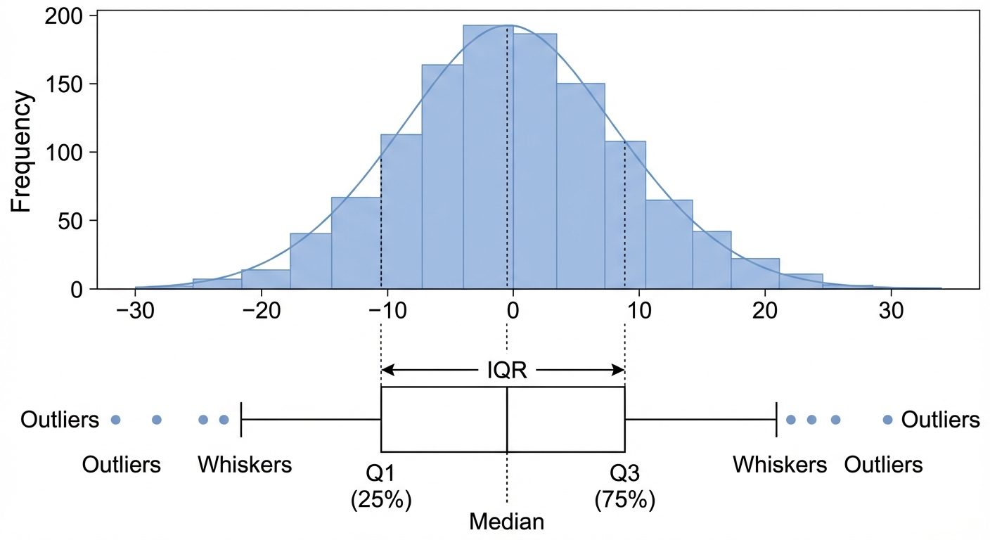
A. Histogram (Numerical)
- Purpose: Visualizes the frequency distribution of a continuous variable.
- Interpretation: Helps identify if data is Normal (Gaussian), Skewed (left/right), or Bimodal.
- Key Parameter:
bins(determines the granularity of the intervals).
B. Box Plot (Numerical)
- Purpose: Summarizes statistical properties using quartiles.
- Components:
- Box: Represents the Interquartile Range (IQR = Q3 - Q1), containing the middle 50% of data.
- Line inside box: Median (Q2).
- Whiskers: Extend to 1.5 * IQR.
- Points outside whiskers: Outliers.
C. Count Plots (Categorical)
- Purpose: Displays the count of observations in each categorical bin using bars.
- Usage: Identifying class imbalance (e.g., 90% "Yes" vs 10% "No").
4. Bivariate Analysis
Bivariate analysis investigates the relationship between two variables (X and Y).
A. Scatter Plots (Numerical vs. Numerical)
- Description: Points plotted on a Cartesian plane.
- Analysis:
- Direction: Positive correlation (upward slope), Negative correlation (downward slope).
- Strength: Tightly clustered points imply strong correlation.
- Shape: Linear vs. Non-linear relationships.
B. Line Plots (Numerical vs. Numerical/Sequential)
- Description: Data points connected by straight line segments.
- Usage: Best for Time Series analysis (e.g., Sales over months) to visualize trends.
C. Violin Plots (Categorical vs. Numerical)
- Description: A combination of a Box Plot and a Kernel Density Estimate (KDE).
- Advantage: Unlike a box plot, a violin plot shows the shape of the distribution (probability density) of the data at different values.
- Interpretation: Wider sections represent a higher probability that members of the population will take on the given value.
5. Correlation Analysis and Multicollinearity
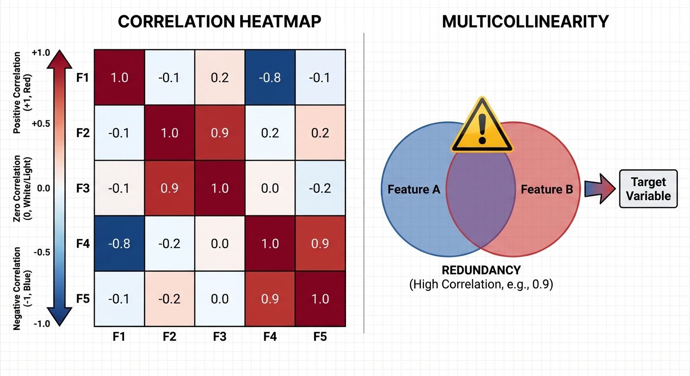
A. Correlation Heatmaps
Correlation measures the statistical relationship between two variables. The Pearson Correlation Coefficient (r) ranges from -1 to +1.
- r = 1: Perfect positive correlation.
- r = -1: Perfect negative correlation.
- r = 0: No linear correlation.
Heatmap: A graphical representation of the correlation matrix where values are depicted by color intensity.
- Warm colors (Red): Positive correlation.
- Cool colors (Blue): Negative correlation.
B. Multicollinearity
- Definition: A phenomenon in which two or more independent variables (features) in a regression model are highly correlated with one another.
- Problem: It makes it difficult to determine the individual effect of each independent variable on the dependent variable. It destabilizes coefficients (makes them sensitive to small changes).
- Detection:
- Correlation Matrix (Values > 0.8 or < -0.8).
- VIF (Variance Inflation Factor): VIF > 5 or 10 indicates high multicollinearity.
6. Distribution Analysis
Analyzing the shape of the data distribution is crucial for selecting appropriate statistical tests and model assumptions.
A. Skewness (Asymmetry)
Measures the lack of symmetry in a dataset.
- Normal Distribution: Skewness ≈ 0. Symmetrical.
- Positive Skew (Right-skewed): Tail extends to the right. Mean > Median. (e.g., Income distribution).
- Negative Skew (Left-skewed): Tail extends to the left. Mean < Median. (e.g., Age at death).
B. Kurtosis (Tailedness)
Measures the "tailedness" or the presence of outliers compared to a normal distribution.
- Mesokurtic: Similar to normal distribution (Kurtosis ≈ 3).
- Leptokurtic: Heavy tails, higher peak (Kurtosis > 3). High probability of outliers.
- Platykurtic: Light tails, flat peak (Kurtosis < 3). Low probability of outliers.
7. Detecting Patterns, Anomalies, and Trends
A. Patterns
Recurring structures in data.
- Seasonality: Regular fluctuations (e.g., ice cream sales usually peak in July).
- Cyclic: Fluctuations unrelated to the calendar (e.g., economic booms and busts).
B. Anomalies (Outliers)
Data points that differ significantly from other observations.
- Detection Methods:
- Z-Score: Points with a Z-score > 3 or < -3.
- IQR Method: Points < or > .
- Visualization: Scatter plots (points far from the cluster) or Box plots.
C. Trends
The long-term movement in time-series data.
- Upward/Downward Trend: General increase or decrease over time.
- Stationary: No trend; mean and variance remain constant over time.
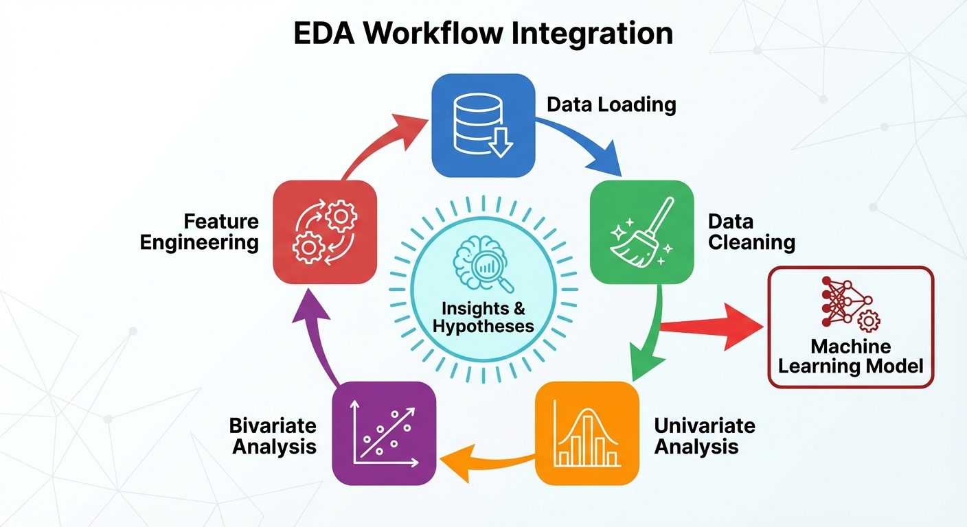
8. EDA Workflow Integration
EDA is not a one-time step but an iterative process integrated into the ML pipeline.
- Problem Definition: Understand what needs to be solved.
- Data Collection & Loading: Import data using Pandas.
- Data Cleaning: Handle missing values, duplicates, and type conversion (often interleaved with EDA).
- Univariate Analysis: Understand individual variables.
- Bivariate/Multivariate Analysis: Understand relationships and correlations.
- Feature Engineering: Create new features based on EDA insights (e.g., binning skewed data, log transformation).
- Pre-processing for Model: Scaling, Encoding.